
A Guide to Font Choice
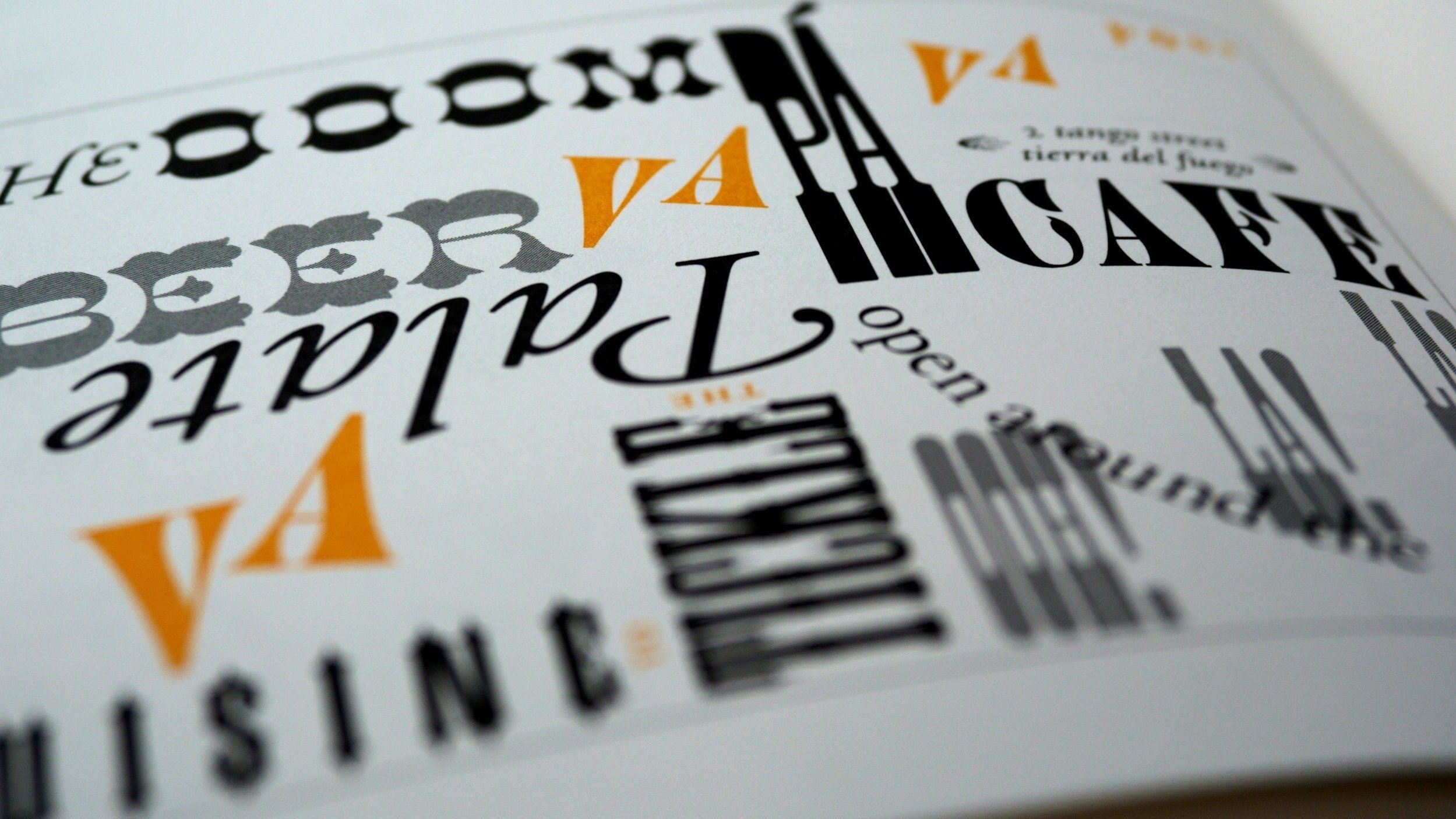
Typography Matters
In the intricate landscape of printed labels, the significance of typography cannot be understated. Fonts wield a silent yet powerful influence on brand perception, readability, and overall aesthetics.
In our guide we look into the crucial role of selecting the correct fonts for printed labels, exploring various options and considerations that businesses should bear in mind to make informed and impactful choices.
The Options and Considerations
Brand Personality and Consistency:
Fonts, like colours, contribute to the visual personality of a brand. Whether sleek and modern or classic and traditional, the chosen font should align with the overall brand identity. Consistency in font usage across various marketing materials, including labels, reinforces brand recognition and fosters a cohesive brand image.
Readability and Legibility:
The primary purpose of a label is to convey information, and readability is paramount. Opt for fonts that are easily readable, even in smaller sizes. Consider factors such as letter spacing, line height, and character width to ensure best legibility. Avoid overly decorative or complex fonts that may hinder understanding.
Font Hierarchy:
Labels often require the presentation of information in a hierarchical manner. Establish a clear font hierarchy by selecting distinct fonts, weights and sizes for headline, subheadings, and body text. This not only enhances visual appeal but also guides the consumer's eye through the essential information on the label.
Contrast:
Introduce contrast between font styles to add visual interest. Combining a bold headline font with a simpler body text font can create a dynamic and engaging label design.
Contextual Appropriateness:
Different contexts and industries may call for specific font choices. A playful and whimsical font may be suitable for a children's product but might appear unprofessional on pharmaceutical packaging. Consider the nature of the product, target audience, and industry norms when selecting fonts to ensure appropriateness in context.
Versatility and Scalability:
A well-chosen font should be versatile and scalable across various label sizes and formats. Ensure that the font stays clear and keeps its visual integrity when applied to both small and large labels. Fonts that may appear crisp in digital formats might lose clarity when printed, so experimentation is key. Test the font at different sizes to guarantee readability in diverse packaging scenarios. You could also consider investing a small amount of money in having a wet proof printed. This is simply a test print of your artwork on the label material that you can then check for suitability before formally going to print. Read more about the benefits of having a wet-proof here.
Printing Technology and Resolution:
Printing technology can affect how fonts appear on the final label. Different printing methods may have varying capabilities in reproducing delicate details. Collaborate closely with your printing partner to choose a font that aligns with the printing technology used and ensures crisp, clear results.
Brand Storytelling:
Fonts can contribute to the storytelling aspect of a brand. Consider whether a serif, sans-serif, script, or display font aligns with the narrative you wish to convey. Each font style carries its own connotations, so select fonts that harmonise with the brand's story and values.
Accessibility Considerations:
In today's diverse marketplace, accessibility is a key consideration. Choose fonts that accommodate individuals with visual impairments. Opt for fonts with clear distinctions between characters, proper letter spacing, and consider using bold or italic styles for emphasis.
The art of selecting fonts for printed labels requires a delicate balance between brand identity, readability, and contextual appropriateness. By considering the personality of the brand, prioritising readability, and understanding the contextual nuances, you can ensure that your labels not only capture attention but also effectively communicate essential information to consumers, contributing to a positive and memorable brand experience.


The Don’ts When Choosing Fonts
Overcomplicate
Don't overcomplicate your label with an excessive variety of fonts. Stick to a well-curated choice to keep a clean and professional appearance.
Neglect Readability for Style
Don't sacrifice readability for the sake of a trendy or elaborate font. Style should complement readability to ensure that consumers can quickly absorb essential information.
Underestimate Spacing
Don't underestimate the importance of spacing. Proper letter and line spacing contribute to overall readability, preventing the text from becoming cluttered and overwhelming.
Ignore Printing Constraints
Don't overlook the impact of printing constraints on font appearance. Some intricate fonts may not reproduce well in smaller sizes or certain printing methods, so consider the technical aspects of your label production.
Common Issues to be Aware of
Readability
One of the foremost challenges in font choice is ensuring readability. Certain fonts may appear visually appealing but lack clarity when printed in smaller sizes. Poor readability can hinder consumers' ability to absorb crucial information, undermining the effectiveness of the label.
Overcrowding Text
Overcrowded text, caused by inappropriate font sizes or excessive content, can overwhelm the label design and diminish its effectiveness. Use whitespace and hierarchy to create balanced layouts.
Technical Limitations
Fonts that appear crisp and elegant on digital platforms may not translate seamlessly to printed labels. Ignoring printing considerations such as ink absorption, bleed, and resolution can lead to unexpected font distortions or inconsistencies in the final printed labels. Take printing factors into account during font selection to achieve desired results.

How do I find a dependable printing partner
to ensure my font choices suit printed labels?
The process of choosing fonts for printed labels is fraught with challenges that require careful consideration. By addressing common issues at the beginning of the process, you will save time in the long run. If you are unsure of your font choices, then please speak to one of our experienced team. We will be able to guide you through the process to ensure your printed labels and font selection meet your expectations and create labels that effectively communicate your brand message while captivating consumers' attention.
Related articles: