A Guide to Choosing Colours for Labels
The Art of Choosing Colours for Printed Labels
The significance of choosing the correct colours for your printed labels, cannot be overstated! Beyond mere aesthetics, the colours chosen for labels play a crucial role in conveying brand identity, ensuring readability, and influencing consumer perceptions.
In our guide we explain the importance of selecting the right colours for your printed labels, while exploring various options and considerations to guide you in making informed choices. We also cover the dos and the don’ts when choosing your colours, to ensure your labels stand out for the right reasons.
The Options and Considerations
Brand Consistency:
One of the primary considerations when choosing colours for printed labels is keeping brand consistency. Colours are powerful brand elements that evoke emotions and associations. By aligning label colours with your brand palette, you reinforce brand identity and create a cohesive visual language across all touchpoints. Consistency builds brand recognition, fostering trust and loyalty among consumers.abels, etc.
Readability and Contrast:
While aesthetics is essential, the practicality of label readability must not be overlooked. Sharp contrast between text and background ensures that essential information is easily discernible. Keep in mind that some people may struggle to read light text on dark backgrounds due to ‘visual contract sensitivity’. Our eyes are naturally more sensitive to differences in brightness and contrast, and reading white text on a black background can create a high contrast scenario that may strain the eyes, particularly in low-light conditions.
Opt for colours that enhance legibility, especially when dealing with small fonts or intricate designs. Conduct thorough testing to verify that your chosen colour scheme keeps readability in various lighting conditions.
Colour Psychology:
Colours evoke specific emotions and perceptions. Understanding colour psychology is vital when selecting hues for printed labels. For example, blue is often associated with trust and reliability, while red can convey energy and passion. Consider the intended message of your label and align it with the psychological impact of your chosen colours to elicit the desired consumer response.
Cultural Sensitivity:
In a global marketplace, cultural considerations are paramount. Colours may hold different meanings across various cultures, and what may be positive in one region could be perceived differently in another. Research cultural colour associations to ensure that your label resonates positively with your target audience and avoids unintended misinterpretations.
Printing Techniques:
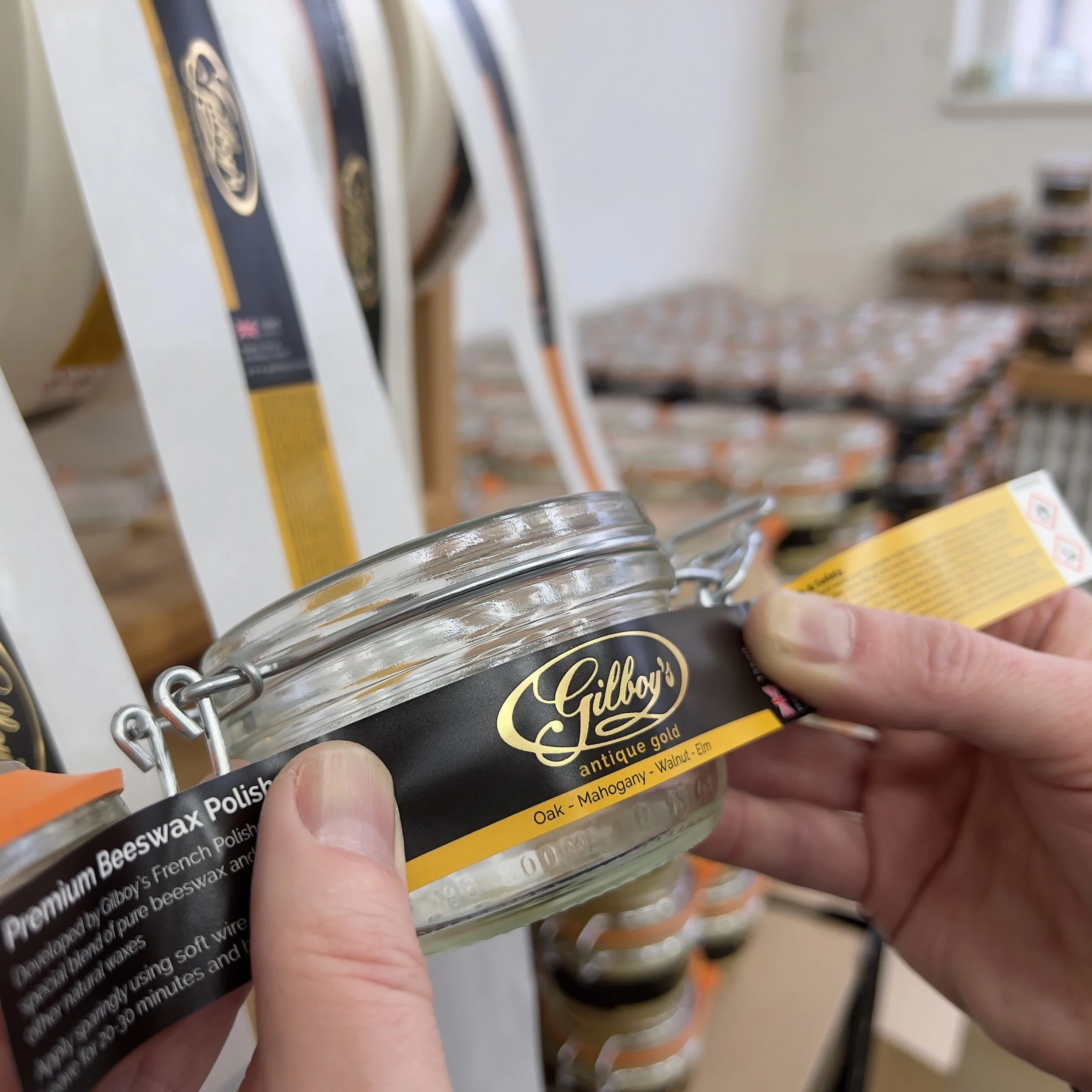
Different printing techniques can influence how colours appear on the final label. Whether using digital printing, foil blocked or spot UV, be aware of the colour reproduction capabilities of each method. Work closely with your printing partner to ensure accurate colour representation and consistency across label batches.
Material and Finish:
The choice of label material and finish can affect how colours are perceived. Matte finishes may absorb more light, resulting in subdued colours, while glossy finishes can enhance vibrancy. Consider the characteristics of the label material and finish to achieve the desired visual impact.
Lighting Conditions:
Conduct thorough testing to verify that your chosen colour palette keeps visibility and appeal in different lighting conditions. This ensures consistent recognition regardless of the environment.
Regulatory Requirements:
Certain industries, such as food and pharmaceuticals, may have specific color-coding requirements for labels to convey information about contents or potential hazards. Familiarise yourself with any regulatory standards applicable to your product and ensure that your label colours follow these guidelines.
By approaching colour choices strategically, businesses can create labels that not only captivate consumers visually but also communicate essential information effectively, ultimately contributing to the overall success of your products in the market.
The Don’ts When Choosing Colours
Here are some of the don’ts to be aware of when choosing colours:
Clash with Colour Trends
Don't blindly follow colour trends without considering their alignment with your brand identity. While staying current can be beneficial, ensure that trendy colours complement your overall brand image.
Sacrifice Readability for Aesthetics
Don't compromise label readability for the sake of aesthetics. Striking a balance between visual appeal and practicality ensures that consumers can easily access crucial information.
Rely Solely on Personal Preferences
Don't base colour choices solely on personal preferences. Consider the preferences and expectations of your target audience to create labels that resonate effectively.
Common Issues to be Aware of
Lack of Consistency
One of the most common issues is a lack of consistency across label designs. It's crucial to establish and adhere to a cohesive colour palette that aligns with your brand's visual identity across all label variations.
Inaccurate Colour Reproduction
Discrepancies between the intended colours and their reproduction on printed labels can occur due to limitations in printing technology or inconsistencies in colour management. It's essential to collaborate closely with your printing partner, conduct colour tests, and ensure proper calibration to achieve accurate colour reproduction.
Insufficient Testing
Rushing into finalising colour palettes without thorough testing across various lighting conditions and label materials can lead to unforeseen issues. Lack of testing may result in colours appearing differently than expected, compromising visual appeal and brand consistency.
How do I find a dependable printing partner
to ensure my colour choices suit printed labels?
The journey in selecting colour palettes for printed labels is rife with potential pitfalls that can affect brand perception, readability, and regulatory compliance. Ensuring you have a reliable printing partner who understands the reproduction of your design, in the long run, will save you time, stress and money. If you are unsure of your colour choices, then please speak to one of our experienced team. We will be able to guide you through the process to ensure your printed labels and colour choice meet your expectations. Together we can achieve beautiful, quality labels that you can be proud of.


